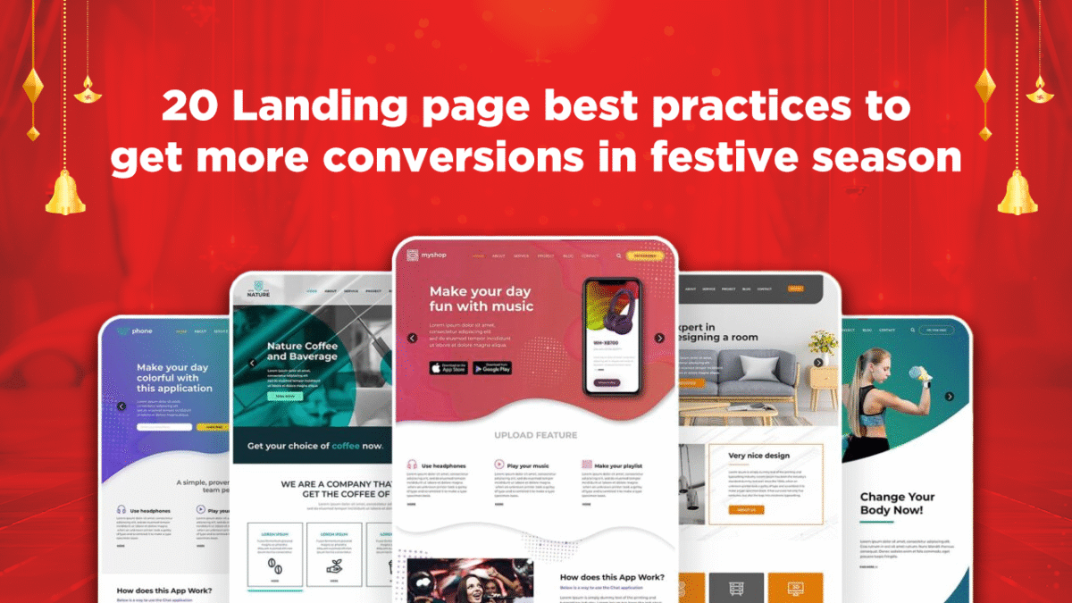
Festive season clicks are not hard to get. What’s hard is making them count.
As an affiliate, you already know how the next few months will go. The traffic surges, every platform is flooded with promotions, and brands roll out headline-grabbing offers like “Flat 50% Off” or “Buy 1 Get 1 Free.” It’s exciting but crowded, especially as more users come online from across the country. In fact, in 2024, India’s e-commerce festive sales reached ₹1.2 lakh crore, a 12% year-on-year jump. Over 60% of this demand came from Tier II and III cities (Upstox). The appetite to buy is clearly there, but so is the noise. Everyone is running offers. Everyone wants attention. And users are deciding within seconds whether to stay on your page or move on.
So when someone lands on your page, they need answers fast. What’s the deal? Can I trust this? Where do I click? If your page doesn’t make this clear in seconds, they’re gone. That’s where most campaigns lose out, not because the offer is weak, but because the landing page doesn’t guide users well.
In this blog, you’ll find 20 simple, practical ways to improve your landing pages for the festive season, so your traffic doesn’t just look good in reports, it actually converts.
Why Festive-Focused Landing Pages Drive More Conversions
The difference between a regular landing page and a festive one isn’t just design; it’s intent alignment. During festive periods, users aren’t casually browsing. They’re searching with purpose, and their decision-making is faster, but also more selective. They compare deals, check delivery timelines, and prioritize convenience over brand loyalty. A landing page that doesn’t acknowledge the season feels out of sync and quickly gets ignored.
Now consider this:
-
- A generic landing page might showcase 20 products in no particular order.
- A festive landing page highlights the most relevant offers first (like “Rakshabandhan Gifts Under ₹1000”), includes a clear expiry date, mentions extra discounts via coupons, and uses visual cues that say, “This is for now.”
That’s the edge affiliates need.
A festive landing page captures urgency, simplifies decision-making, and shows that you understand what the user came for. Lets say you’re promoting Trybloom’s curated wellness kits or Shopsy’s 91% off deals, formatting that message in a seasonal, streamlined layout makes all the difference.
And the payoff? Higher engagement, lower bounce, and more commissions, without changing your traffic strategy.
What Drives Buying Behaviour During Festive Campaigns
Festive shopping isn’t just about discounts; it’s about timing, emotion, and urgency working together. People don’t wait for Independence Day or Rakshabandhan sales just to save money. They wait because it gives them a reason to spend without hesitation. There’s social permission to buy, whether it’s a gift, a wardrobe upgrade, or a beauty kit they’ve been eyeing for weeks.

As an affiliate, your landing page needs to match that state of mind.
Here’s what typically influences decisions during festive periods:
-
- Deadlines increase action. Phrases like “Only Today” or “Ends in 12 Hours” directly influence how quickly someone clicks “Buy Now.”
- Bundled value looks better than standalone discounts. A deal like “Buy 3 at ₹999” feels more festive and curated than a flat 30% off on one item.
- Emotional relevance boosts engagement. A page mentioning “Rakhi Gifts for Her” or “Freedom Sale Essentials” connects better than a generic “Top Deals” banner.
And most importantly, clarity beats creativity. Festive buyers aren’t looking to explore. They want confidence: in the offer, the process, and what happens next.
20 Landing Page Upgrades That Boost Conversions During Festivals
During the festive season, users come with high intent but limited patience. If your landing page doesn’t load fast, show the offer clearly, or guide them smoothly to the next step, they’ll leave. These 20 upgrades are practical changes affiliates can make to improve clarity, build trust, and increase conversions across seasonal campaigns.
- Mention the Festival in the Headline: Start your page with a clear title that shows both the occasion and the offer. According to Unbounce, personalized headlines can increase conversions by over 300%. Example: “Diwali Dhamaka – Flat 50% Off on Ethnic Wear.”, “Rakshabandhan Gifting Deals – Buy 2, Get 10% Off on Giva Jewellery” or “Hello Beauty Sale – Up to 50% Off on Tira.” Users should instantly know what the page is about and why it matters right now.
- Keep the Best Offer at the Top: Most users won’t scroll too far. Your top section should highlight your strongest deal, ideally, something like Shopsy’s Up to 91% Off on Women’s Fashion or Trybloom’s Buy 3 at ₹999 wellness combo. According to Nielsen Norman Group, 80% of user attention is spent above the fold, so your strongest deal should be placed there. This reduces bounce and encourages deeper engagement. These are offers that can grab attention and encourage users to scroll down.
- Use a Timer to Show Time Left: Festive sales are short-lived. If a deal is part of a limited-time event like Myntra’s End-of-Season Sale or Ajio’s Buy 1 Get 1 Free on select styles, add a timer showing when it ends. Countdown timers create urgency and trigger FOMO. Sender.net found that limited-time offers can boost conversions by up to 332% when paired with visual urgency cues like timers. This creates pressure to act before the deal is gone.
- Keep the Page Simple and Clean: Avoid filling your page with too much text or too many banners. Visually complex sites are rated as less trustworthy and less appealing. On the other hand, a clean layout helps users focus on the deal. Stick to 1–2 fonts, a soft festive colour palette, and clear product images.
- Make Sure It Works on Mobile: Most of your festive traffic will come from mobile. Test your page on different phones. Unbounce reports that 82.9% of landing page traffic comes from mobile devices, yet many pages still aren’t optimized. Make sure the images load fast, the buttons are easy to tap, and nothing breaks on scroll.
- Keep a “Buy Now” Button Always Visible: Add a CTA button that sticks to the bottom of the screen, especially on mobile. HubSpot reports that placing CTAs in persistent locations increases click-through rates by 30%. This way, even if users scroll down, the action button stays in front of them. It makes it easier for them to click without having to scroll back up.
- Don’t Hide Extra Discounts: If an offer gives both a flat discount and a coupon (like “Flat 40% + 10% with code”), show the full savings clearly. Baymard Institute found that 61% of users abandon carts due to hidden costs or unclear pricing. Don’t expect people to figure it out themselves; lay it out in one line.
- Group Items by Relevance: If you’re working with multiple verticals like Bacca Bucci’s 70% off on sneakers and M&S India’s flat 50% off on clothing, group products by gender, price range, or gifting purpose. For example: “Footwear Under ₹1,000,” “Loungewear Picks for Her,” or “Last-Minute Rakhi Gifts.”
- Use Light Festive Visuals, Not Heavy Banners: It’s good to use some festive design, rakhis, diyas, ribbons, tricolour elements, but don’t overdo it. KlientBoost found that faster-loading pages reduce bounce rates by 70%. So, keep banners small and mobile-friendly so your page doesn’t slow down.
- Show Delivery Info If It’s Time-Sensitive: If the offer is tied to a festival like Rakhi, and delivery can be done before the date, say it. “Get it by August 18” is more useful than “Ships soon.” Amazon-style delivery promises can increase conversion rates, especially for last-minute buyers.
- Add Trust Logos Near the CTA: Icons like UPI, Paytm, Visa, or “100% secure payment” near your button help users feel safer. Trust elements near CTAs can increase conversions by 42% according to Hostinger. These small visuals matter when someone is unsure about completing a purchase.
- Mention Real Scarcity, Not Fake Pressure: If stock is limited or a deal ends today, say it. For example, “Only 3 left at this price” or “Last 6 hours.” But don’t fake it,, people can tell, and it hurts credibility. Use stock counters or time-sensitive phrases honestly.
- Use CTA Text That Matches the Context: Instead of a plain “Buy Now,” try something like “Shop Rakhi Deals” or “Grab Festive Offer.”Sender.net reports that personalized CTAs convert 202% better than default ones. It connects better with the mood and makes the button feel more relevant.
- Don’t Forget to Mention COD or Returns: A quick line like “Cash on Delivery available” or “7-day returns” builds trust. Especially in India, COD is a preferred method, over 60% of online shoppers opt for it, according to local eCommerce studies. And during festivals, users want to feel confident that they can rely on the purchase.
- Check Your Page Speed: Slow pages kill conversions. Keep image sizes low and remove anything that doesn’t need to be there. Google reports that 53% of mobile users abandon pages that take over 3 seconds to load. Run a speed test and aim for under 3 seconds of load time, especially on mobile data.
- Show a Final Offer When They Try to Leave: If someone moves to exit, trigger a simple pop-up with a small nudge: “Use code like FESTIVE10 before midnight.” Don’t overdo it, but this tactic can win back undecided users.
- Keep the Focus on One Goal: Remove menus, extra links, or unrelated product suggestions. Your landing page should guide users to one clear action: viewing the offer or clicking through to buy. Limiting your landing page to a single CTA can increase clicks by over 371% and grow sales by a huge 1,617% according to WPBeginner.
- Match the Offer With the Ad They Clicked: If your ad says “Buy 1 Get 1 Free on Ajio Kurtas,” your page should say the same thing. A mismatch makes users drop off immediately, it feels like bait and switch. In fact, mismatched messaging leads to bounce rates over 70%, according to Sender.net.
- Use Heatmaps or Scroll Tracking If You Can: Tools like Microsoft Clarity or Hotjar show you how people interact with the page, where they click, how far they scroll, where they leave. It’s helpful data you can use to improve the page mid-campaign.
- A/B Test Key Elements Before Launching at Scale: Before sending a lot of traffic to your landing page, test small things, like two versions of your headline or button text. According to Sender.net, A/B testing can improve conversion rates by up to 49%. So, run them with limited traffic and see which performs better, then go all-in on the winner.
Wrapping Up!
During the festive season, timing, clarity, and user experience matter more than ever. Your ad might get the click, but it’s your landing page that decides whether that click turns into revenue. And the good news is, you don’t need a complete redesign. Small, thoughtful changes like faster load times, clear CTAs, upfront offer details, and mobile-first design can go a long way. Especially when the audience is ready to buy, the right page experience can help you capture conversions that would otherwise slip through.
As you gear up for Rakhi, Independence Day, Diwali, and more, take time to revisit your pages with these 20 upgrades in mind. Even a few improvements can make a noticeable difference in performance.
If you want to make the most out of your campaigns this festive season, vCommission makes it easy to access high-performing brands, ready-to-go creatives, and real-time tracking, so you can focus on what matters: converting traffic into results. Sign up now to get started!
 How Affiliates Can Generate Consistent Revenue with PPC Affiliate Marketing in 2026
 Credit Card and Loan Affiliate Campaigns: Strategies for Higher Conversions
 Semrush Affiliate Program: A High-Payout Offer for Marketers and SEO Publishers
 10 Best Affiliate Marketing Platforms of 2026
 Fintech Affiliate Campaigns: Monetizing Finance Traffic with High-Payout Offers